
Heremom — A new brand identity

Heremom, a postnatal massage brand, believes that recoveryis not only physical, but emotional as well.
With a team member preparing for childbirth, and womenmaking up half of the AMJ team, we chose to supportHerermom through Minus One, in support of the role it playsfor women.
Beyond massage, Heremom offers guidance andconversation— helping women adapt not only to theirpostnatal bodies, but also to new environments andstates of mind, and to receive those changes with ease.

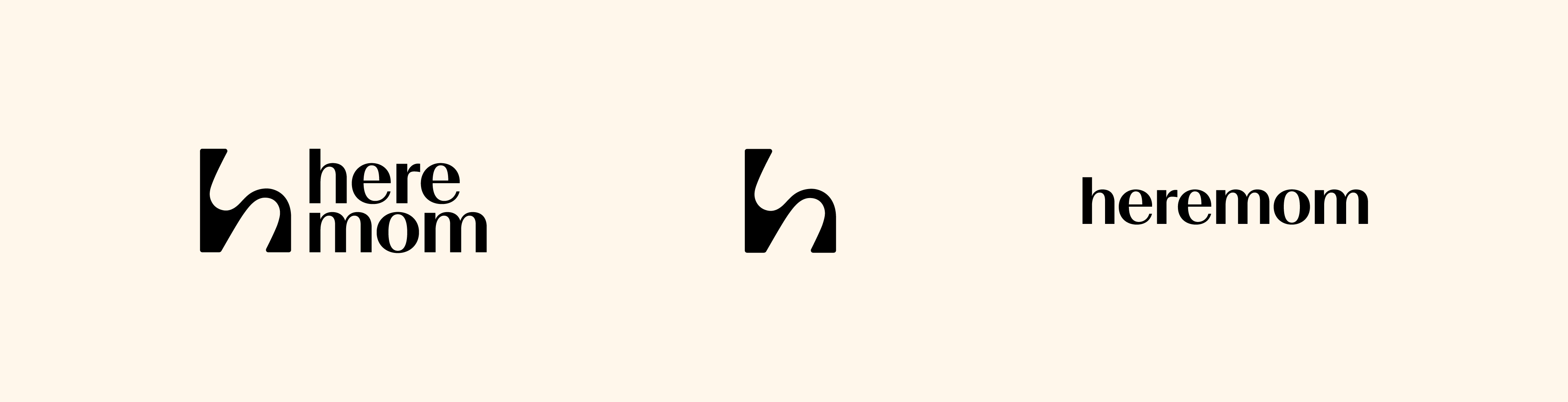
In designing Heremom’s logo, the AMJ design team sought to capture a sense of support— a place to lean on, and a state of mind that is gentle, flexible, and calm.
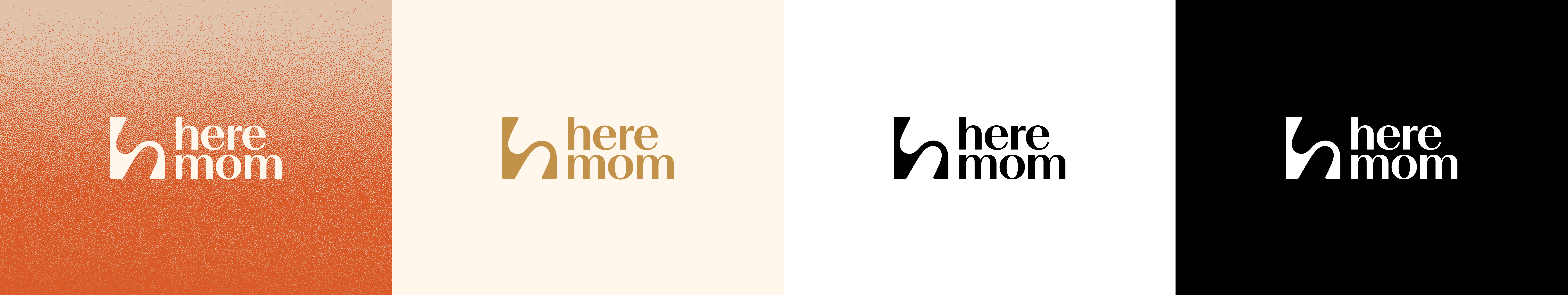
The tan-orange color reflects a mother’s quiet strength and her enduring energy for life.
The logo resembles the form of a pregnant woman.It also recalls a chair made for rest, or the quiet movement of hands pressing softly.
Client
heremom
STUDIO AMJ
-1 Project